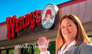
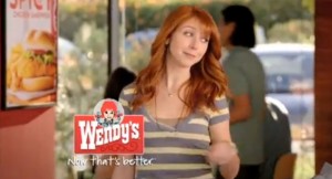
Wendy’s has been making huge strides in their marketing strategies in the last few years. They recognized that they had fallen to the back of the pack in terms of fast food companies. They wanted to reinvent themselves and become relevant as McDonald’s, Taco Bell, Burger King, and Carl’s Jr. are in consumer’s minds. They answered with a full arsenal of ways to try and get people back to Wendy’s. They started by advertising again, which was a hit and miss process. They tried to implement their new premium menu items to set them apart from their competitors in the commercials, which helped. Next they made the push to show off their dollar menu items; which also helped. When they tried to put the actual Wendy in the commercial it wasn’t reacted to as planned. They have now, thrown the actual Wendy out of the commercials and now moved to a thinner, younger, more attractive red headed girl to be the new Wendy. This moved Wendy’s back into the positive direction it was going. Sorry real Wendy. And now they are beginning to redesign all the restaurants, modernize the uniforms, and obviously they reinvented the classic logo.
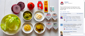
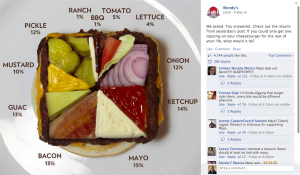
All of this has brought them closer into relevance among the other fast food competitors. However, many people think that their online presence has made the difference. They have updated their website to be more simple, flush, and contemporary; gearing it more towards devices like smartphones and tablets. However, it is through its Wendy’s recent social media presence that received the buzz. Wendy’s decided to ask the question to its followers on Facebook if they could only get one topping on their burger for the rest of their lives what would it be. This post was well responded to getting over 3,000 likes and 3,600 comments (Carter 2013). This was an extremely successful in engaging their audience in their brand, yet this was not the end of their plot. They then posted the results as a pie chart, but on a burger patty with the actual ingredients.
You may say, well this is all great, but does it actually have that much of an effect on the actual business? My answer to that would be that’s what their stock is saying. An article from Yahoo Finance claims that Wendy’s is “proving to be a serious turnaround contender” (Ogg 2013). Wendy’s has traded more than 30 times this year’s expected earnings, while it fast food competitors like McDonald’s have had no change. So after the new logo, menu additions, contemporary restaurant redesign, successful new technological connection, and dramatic stock increase, I would agree with the caption under the new more attractive Wendy (Del Gigante 2013). Now That’s Better.
References
Carter, C. 2013. Facebook Marketing Content Inspiration: Wendy’s (Burger) Pie Chart. Ignite Social Media. Retrieved from http://www.ignitesocialmedia.com/facebook-marketing/facebook-marketing-content-inspiration-wendys/
Del Gigante, J. 2013. Wendy’s Marketing Makeover Continues with New Responsive Website Design. MDG Advertising. Retrieved from http://www.mdgadvertising.com/blog/wendys-marketing-makeover-continues-with-new-website-design/
Ogg. J.C. 2013. Wendy’s Win: No Change for McDonald’s, and Fast-Food Sector Concerns. Yahoo Finance. Retrieved from http://finance.yahoo.com/news/wendy-win-no-change-mcdonald-163051514.html


2 Responses to Now That’s Better: Wendy’s Marketing Revamp