Coca-Cola and its logos

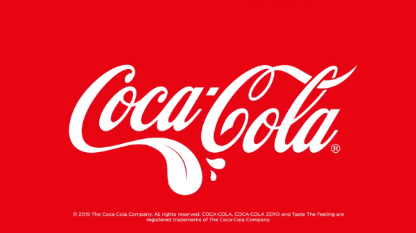
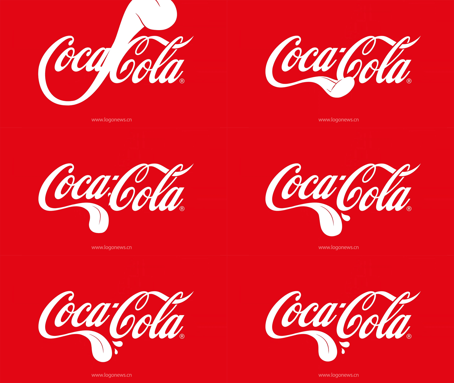
If you take a closer look at the picture above, probably you’ve found something different between this logo and the iconic one: the streamer under the letter “C” turned into a tongue!

In early July, Coca-Cola launched this new logo for its global advertising campaign. By using “tongue” in the ads and the logo, this beverage giant hope consumers can feel their best memories in their life with them. Targeting on the young generation, the goal of this campaign is to deliver a message that Coca-Cola is always there in every happy moment, establishing an emotional association between Coca-Cola and happiness on people’s minds.
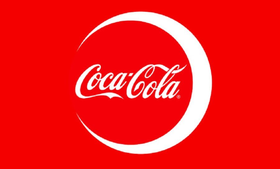
In fact, similar to this “tongue” logo, Coca-Cola tweaks its logo for many different campaigns. For example, in May 2019, it added the Islamic crescent moon symbol to the iconic logo when launching a Ramadan campaign in Norway. Through this campaign, Coca-Cola intended to establish a closer tie to Muslins in addition to boost the sales. According to the marketing manager of Coca-Cola in Norway, Coca-Cola also wanted to state its position on diversity and emphasize the importance of diversity to society, showing itself as a responsible social actor.

The use of dynamic logos
In general, using dynamic logos could bring advantages to brands. First, dynamic logos enables brands to convey different qualities depending on the various situations to audiences. For example, the dynamic logo that Coca-Cola used in the Ramadan campaign helps Coca-Cola to communicate the theme and the story of this campaign better. Also, the dynamic logo could increase brand exposure.
However, the significant point for creating dynamic logos is to keep the essential elements of the iconic logo. Creating some unrelated logo will even take disadvantages to brand identity.

2 Responses to The 133 years old brand and its dynamic logos