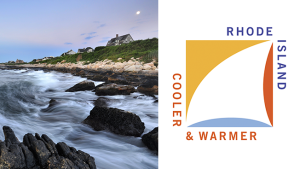
What do you think when you hear “Rhode Island”? Do you think of quaint New England towns, maybe of waves upon a rocky beach?
Do you think of anything at all?
If you’re in the latter group, the Rhode Island Commerce Corporation wanted to change that. They announced a $5 million dollar tourism campaign. They hired Milton Glaser, who became famous for designing the “I Heart NY” logo. They even announced a press event to launch the new campaign.
It did not go well.
Viewers immediately noticed that the 2-min commercial included footage from Iceland. (At the :09 second mark, the skateboarder is actually in front the Harpa music hall in Reykjavik.) The backlash on social media (especially Twitter) was swift and brutal.
Beyond such a critical gaffe, many more Rhode Islanders were left puzzled by the rather cryptic tagline. What do they mean “cooler” and “warmer”? The agencies claimed that the tagline was tested considerably amongst different groups of Rhode Islanders, but many remained unconvinced.
Given such fallout, it is no surprise that finger pointing, public apologies, and resignations ensued in due course. The CMO of the Rhode Island Commerce Corporation resigned. The agencies involved agreed to give back a total of $120,000 in taxpayer money, which was used to produce the botched video.
This recent incident was striking to me for one reason: How could they have gone so off-track? Some point to the agencies’ failure to conduct thorough research; others blame the fact that out of state agencies failed to capture what the state is truly like.
If I could hypothesize one reason why the campaign really went wrong, I would suggest that it demonstrates the pitfalls of loving your idea so much it leaves you blind to anything else, both good and bad. In a way, this incident also reminded me of that “Tonopah, Nevada” episode of The Pitch that we watched for class. In that episode, the two men wanted to describe the town as “weird” (if I remember it correctly). However, after testing that idea out with the city council members, they realized that “quirky” was a better fit (especially since “weird” felt offensive to the city council). But at least they listened to such feedback, instead of pushing on with their original idea.
Having gone through our own “big idea” pitches recently for this class, I myself realized how hard it is to keep tweaking and adjusting a big idea based on constant feedback. I think at some point you have to draw the line somewhere, but in Rhode Island’s case, I would argue that they drew that boundary too soon. (And maybe they also should’ve avoided using footage from Iceland in their promo video.)
Sources
http://www.citylab.com/politics/2016/04/the-anatomy-of-a-disastrous-state-branding-campaign/476751/?utm_source=atlfb
http://wpri.com/2016/03/30/new-ri-brand-cooler-and-warmer-cost-550000/
http://www.adweek.com/news/advertising-branding/rhode-island-will-revamp-marketing-campaign-after-disastrous-roll-out-170589
http://turnto10.com/news/local/ri-commerce-corp-releases-state-promotional-video


5 Responses to Tourism Fail