
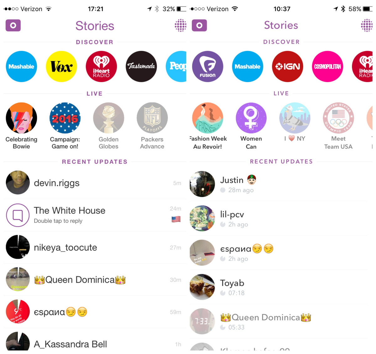
I’m sure you all have noticed by now, but not only did the latest Snapchat update fix a few bugs and make the application run faster, there was also one major unannounced change: the font. Out with Helvetica and in with Avenir; this new font now appears throughout the Snapchat application.
Now, let me repeat again: it was only a font change. But then came the tsunami of Twitter posts and memes about the update, and the verdict is? PEOPLE HATE IT.
https://twitter.com/GabSaab/status/707268063780012032
New snapchat font is annoying. Deleting the app.
— erin schwab (@schwab_erin) March 9, 2016
Snapchat, or “the insanely fast-growing and – to people born before 1990 – straight-up insane messaging app and media platform” is rapidly gaining popularity, with over 100 million active daily users today (Chafkin & Frier, 2016). However, it seems even the entertaining collection of filters and the A-list celebrities are not enough to keep these users completely satisfied. This got me to think, how could something so subtle as a font change cause such a frenzy?
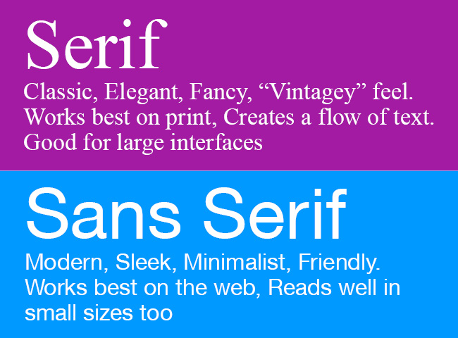
It turns out that brands today need to align not only their mission statement with their brand identity, but also their typography. Font type has a significant impact on how a brand is portrayed to the public and can be used to communicate to an audience and reflect a brand’s character (Halek, 2014). Brands that wish to portray a more professional or luxurious feel can use classic and traditional serif fonts (e.g., Times New Roman, Georgia), while for the more modern and trendy brands, sans serif fonts (e.g., Helvetica, Arial) are the way to go.
Most importantly, it’s crucial for a brand to be consistent and allow their consumers to become familiar with their visual style, because people become attached to the feel of certain brands through visual elements (Guerrero, 2014). When a reliable interface changes, “people experience everything from distaste to a sense of betrayal,” (Halek, 2014). This is supported by experiences that BP and Gap went through when they attempted to rebrand their company, but ultimately failed due to uproars from the public (Hardy, 2013). However, there are other cases like when Apple recently changed their font with the iOS 9 update. While initially people had similar reactions like they did with Snapchat, everyone eventually got used to it.
It seems like even though people may like new things, they don’t really like change. Brands today need to learn how to find that happy medium between updates and innovation. I’m curious to hear what you guys think about this matter and how much of an impact it has on a brand today? How do you feel about Snapchat’s font change, or any other brands for that matter? Can brands truly become successful, so long as they align their identity down to the typography dot?
Thanks for reading! 🙂
Jane Yi
Sources:
Bell, K. (2016, March 8). No, you’re not going crazy: Snapchat’s ios app has a new font. Mashable. Retrieved from http://mashable.com/2016/03/08/snapchat-new-font/#MTpdgh8QPSq4
Chafkin, M. & Frier, S. (2016, March 7-13). If you don’t know it by now, you’ll never make millions on snapchat. Bloomberg Business. Print.
Guerrero, A. (2014, December 14). The art of building a consistent and professional brand identity. Canva. Retrieved from https://designschool.canva.com/blog/brand-identity/
Hardy, T. (2013, October 14). 10 rebranding failures and how much they cost. Canny. http://www.canny-creative.com/2013/10/10-rebranding-failures-how-much-they-cost/
Halek, K. (2014, October 2). How to use typography to align brand identity. Speckyboy Design Magazine. Retrieved from http://speckyboy.com/2014/10/02/use-typography-align-brand-identity/
Koerber, B. (2015, September 16). You’re not going crazy: Apple just changed the font in ios 9. Mashable. Retrieved from http://mashable.com/2015/09/16/ios-9-font-change/#WU3.wKXrPqqd
Web Design. (2013, December 13). Are your fonts projecting the right business image? Wix. Retrieved from http://www.wix.com/blog/2013/12/choosing-fonts-for-your-website/
3 Responses to Oh snap! Made you look.