If you have been watching any form of media in the U.S. lately, you would have most likely seen an ad displaying the Windows 8 live tile start screens. Whether it is a Surface tablet ad (which we watched in class), a HP laptop computer ad, or a HTC Windows phone ad – they all feature the easily recognizable brightly colored tiles from Microsoft’s new operating system (OS).

Unfortunately, all those ads also neglected to demonstrate how users can have total control over their gadget’s live tiles to truly reflect their personality and needs. Moreover, they were pretty standard typical gadget-related ads that weren’t especially out-of-the-box creative, memorable or intriguing. It wasn’t until I saw the Windows 8 campaign arrive on magazine print that I got interested in learning more about Microsoft’s new OS.
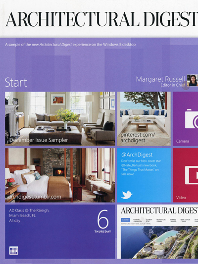
On this December’s issue, Microsoft had managed to take over 14 Conde Nast magazine covers from Vogue, The New Yorker, to Wired, with full page cover attachments that look like a Windows 8 start screen. These Windows 8 start screens are designed and tailored for the magazine’s top editors.

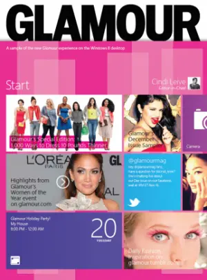
Glamour Magazine’s December promotion featuring a Windows 8 start screen.
Glamour Magazine, for example, depicts a start screen for Editor-in-Chief Cindi Leive with items such as highlights from a magazine event, a tweet that Windows 8 pulled in from @glamourmag, a December Issue Sampler for Windows 8, the Windows camera app, a special edition of the magazine and a holiday-party reminder from the new Windows 8 Calendar app.


It’s not only a great way to show how personalized Windows 8 can get, but also an effective way to target niche consumers; showing a fashion-centric girl who reads Vogue, how Windows 8 can be the fashion-centric phone she wants that cater to her needs. Additionally, imagine glancing at a newsstand and seeing all the Windows 8 start screen magazine covers staring back at you, it will definitely be a memorable sight and grab most people’s attention!
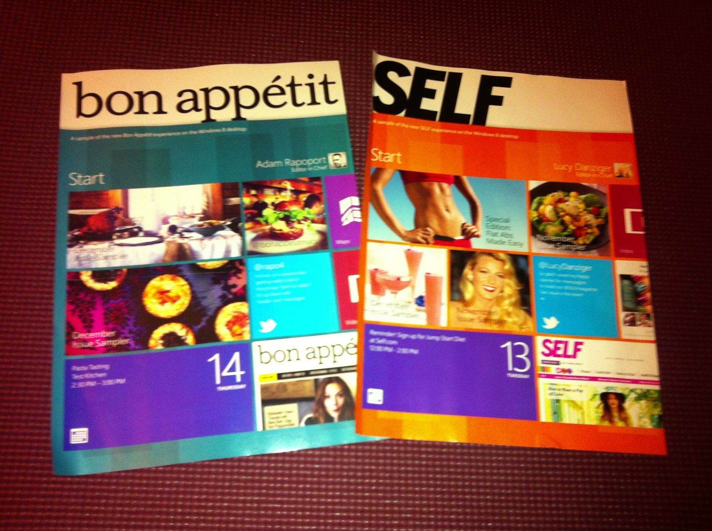
I first encountered these ads at my friend’s apartment. She had just received her monthly magazine subscription on bon appétit and Self, and the unusual magazine cover we were both unaccustomed to, caught our eyes. It was catchy, and relevant to the reader. My friend being an avid foodie with a passion for fitness, was intrigued and impressed by how those windows tiles really catered to her, and immediately took a picture of it to show her friends.

My friend’s December issue of bon appétit and Self magazine.
The covers are something unexpected, relevant, and catchy; which helps make this print section of the campaign pretty sticky. As we have previously mentioned in class, ‘the medium is the message’, where the medium of a front page magazine print really influenced how the message is perceived. I believe that having this part of the campaign executed on any other print media such as billboards or bus stands would not have had the same effect.
On a related note, such creative-ness is not often seen on magazines. Editors traditionally avoid involvement in any paid ad covers, partly to show viewers that their content is not heavily influenced by their ads. So it came as a surprise to me when I found out that Microsoft got these covers attachments for free. The Conde Nast spokesperson explains that the cover attachments had “no advertising dollars involved”, and Microsoft’s paid ads that were inside the magazines were “separate and distinct.” She also clarifies that it was their magazine company’s own initiative to tell readers about its content on Windows 8, and had “clearly coordinated” with Microsoft’s paid ads to make sure they tied together.

A paid Windows 8 magazine ad
I personally find it skeptical that Conde Nast would spend so much money to promote such a new OS platform without a big, ad-buy from Windows in the works. However, in the end of the day regardless of what their agenda is, I think that this collaboration really helped put creativity into magazine print ads, and I would love to see this kind of innovation start to occur more in print advertising.

7 Responses to Magazine covers turned into Windows 8 start screens!