
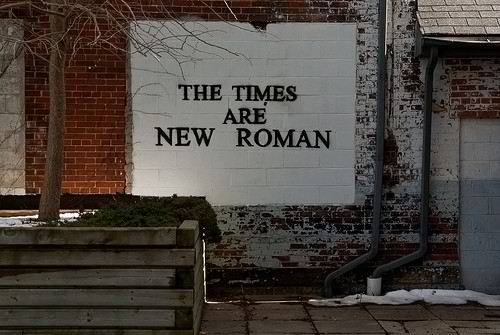
Fonts are like childhood friends, familiar, steady, endearing and predictable. When we see a font, we know what it’s going to say to us. Times New Roman is the serious and responsible friend, Arial is simply the good friend with no opinion, and Helvetica is the wise iconic minimalist. But what happens when fonts defy our expectations, like when Times New Roman attempts to be humorous? Our brains do a double take. The image above serves as an example; the font personality is used to communicate irony through the humorous meaning of the words. Maybe you smirked like I did? Fonts serve as the tone of voice that words intend to communicate, echoing the old adage that it’s not what you say but how you say it that’s important. Font choice matters quite a bit.
The Power of Font Visuals: Seeing = Feeling
In The Art of The Pitch, Coughter (2014) stresses the importance of choosing imagery that will elicit a desired emotional effect. He cites an important study by UCLA Professor, Albert Mehrabian relating to the most impactful ways humans absorb communications, “55 percent of what we take away from communication comes from the visual, 38 percent from the tone of voice, and 7 percent from the actual words” (Coughter, 2014, p. 52). Fonts reflect both the visual and tone of voice categories through the artistic representation of the letter form and the connotations of meaning we attach to what the font is saying. Our brains receive fonts as visual stimuli and make snap emotional judgments about what we’ve seen before our rational mind can grasp what the words are actually saying (Ferrari Carlevari, 2015). This is a really important point to highlight: fonts cast a mood upon the words that are written, which powerfully influences what a reader gleans from the message.
Setting the Mood: Choosing the Right Font
Advertising intends to impact and persuade aligned with specific brand goals; fonts can be used as a tool to build an emotional frame around a message or call to action. Recent research sheds new light on what people really think of everyday fonts such as Times New Roman (serif) and Helvetica (sans serif), which could help brands engineer better advertising outcomes. Font connotations were as follows:
Times New Roman = credibility and competency (Ferrari Carlevari, 2015)
Helvetica = kind, sympathetic, compassionate but not charismatic (Ferrari Carlevari, 2015)
Ferrari Carlevari (2015) also qualified these findings by noting that Google once had a serif logo but changed to a sans serif font. Because Google is the most frequently trafficked search engine in the world, there was speculation that sans serif fonts could benefit from the brand association with credibility, resulting in new font connotations (Ferrari Carlevari, 2015).
Making a Message Stick: Complicated Fonts Are Better
One last little tidbit of information that I found fascinating was in a font choice study relating to memory. “In a semester-long study at an Ohio high school, students who were exposed to slides and handouts using less legible typefaces (such as Comic Sans) performed better on tests than students exposed to materials presented in more-readable type” (Oppenheimer, 2015, para. 1). Oppenheimer (2015) recommends the use of Monotype Corsiva over Arial in continuous sections of text for the greatest amount of reader recall. Advertisers can gain more mileage from this finding in hopes that consumers won’t forget messaging, but this hinges upon content being visually appealing and compelling to begin with.
For further information on font mood association, here are a few industry resources: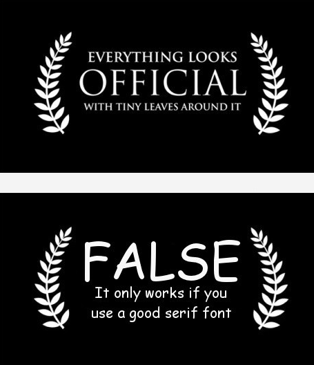
The Psychology of Typography: http://www.makeuseof.com/tag/psychology-typography/
Font Mood Directory: http://www.fontscape.com/explore?70V
Thanks for reading!
Lydia
References
Coughter, P. (2012). The art of the pitch: Persuasion and presentation skills that win business (1st ed.). New York: Palgrave Macmillan.
Ferrari Carlevari, M. (2015). Typeface connotation (Order No. 10046727). Available from ProQuest Dissertations & Theses Full Text; ProQuest Dissertations & Theses Global. (1776197179). Retrieved from http://libproxy.usc.edu/login?url=http://search.proquest.com.libproxy1.usc.edu/docview/1776197179?accountid=14749
Oppenheimer, D. (2012). Hard-to-Read fonts promote better recall. Harvard Business Review. https://hbr.org/2012/03/hard-to-read-fonts-promote-better-recall
10 Responses to More Than Words: How Fonts Influence the Mood of a Message